
First designs, what do you think?
Here are the first basic designs (before they go to the suppliers art section)
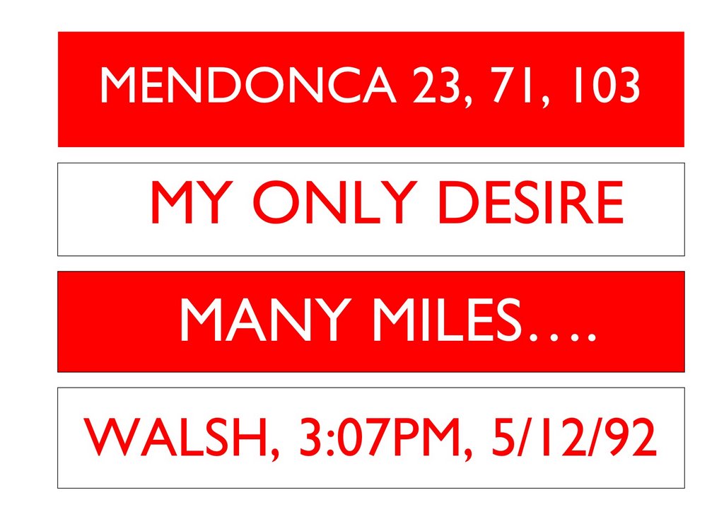
The reason we're going for clear text is that the banner hopefully will be hung from the back of the North Upper, behind the last row of seats, meaning they'll be a fair bit away from people, so the simpler the design, hence the lack of fine design and pictures, making them easier to see. Hopefully they'll be a meter high, the letters are likely to be about 90cm high, using a font called 'Gill San'.
This isn't about choosing one of the designs, hopefully, all 4 designs will be used, it just to check what people think?
What do you think we need to explain, are the banner obvious enough, or will they go over peoples heads?
So here they are, rough and ready
posted by Sash @ 9:48 pm
0 comments
![]()


0 Comments:
Post a Comment
<< Home